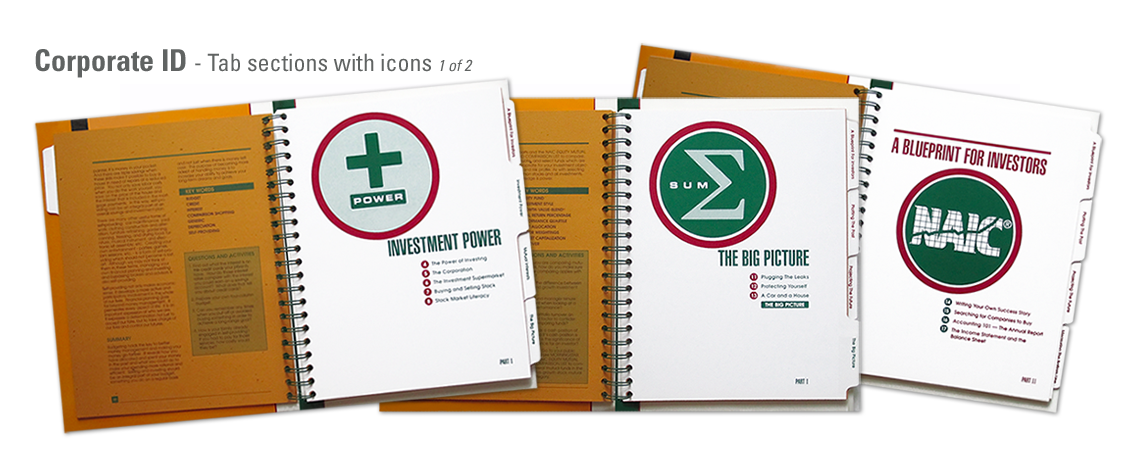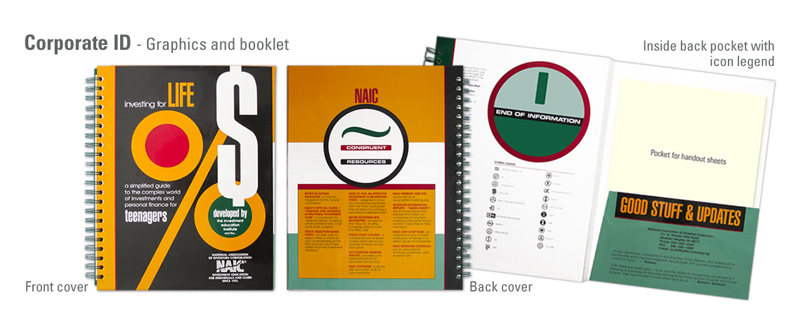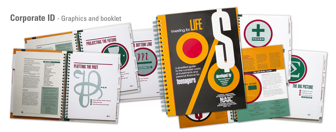
Bold and iconic graphics were developed to appeal to a younger teenage demographic and act as bullet points for the various chapters. The iconic graphics became a symbol legend later implemented into various communications.
The outer cover of the workbook is printed in 4 colors on high gloss card stock for enhanced durability. The extra flap intentionally folds inside to wrap the entire book for protection since the goal is to create a usable tool for young investors to reference often as they learn.
Both inside tab pages and content pages are printed in 2 colors with a spot screen to maintain costs. The tab pages are printed on high gloss white card stock, while the content pages are printed on text weight stock with different flecks and tones.